 Hidden fore-edge painting (as opposed to standard fore-edge painting) was developed in the 17th century as a novelty technique for book decoration. The beauty of this technique lies in the ‘trick’, in that the painting is hidden or secret unless you know to look. As the book stands on the shelf, and as you’d hold it normally, the painting is undetectable and usually looks like a gilded or marbled fore-edge. However, when the book pages are splayed by bending the text block, the hidden fore-edge painting is revealed. Sometimes, this content was relevant to the text, and other times it was simply an interesting or attractive scene. Typically, these paintings were landscapes, battles, religious scenes or figures, or heraldry. Occasionally, even erotic images were hidden in this way.
What the Font!
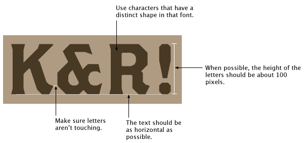
Seen a great typeface but don’t know what it’s called? MyFonts.com operates a very useful section of their website called “What The Font!“. It’s purpose is to identify typefaces from images. This means that you can submit a photograph of some signage, a poster, the side of a bus, a book sleeve, or anything else you can get close enough to photograph.
Friends of Type


In their own words: “Friends of Type features original typographic design and lettering – fresh visual content – practically every day, by the four primary contributors. Posts are meant to log ideas, express ourselves, and inspire each other and our readers. The last week of every month we feature a guest designer, someone we admire and think will elevate our work and the site through their contribution. This is a sketchbook, an archive, a dialogue. The posts are sketches and ideas on visualized language; a collaborative habit born out of the real-time interactions that made us friends in the first place.” Visit them to for some inspiration… view the posts in order, or hit the ‘random’ button for a… well… random selection.

Pictorial Webster’s Encyclopaedia
 John Carrera of Quercus Press has created a hand-bound, letterpress printed book of all of the imagery from the 1864 edition of the Pictorial Webster’s Enyclopedia, a snapshot of all the things that were interesting to 19th century America. The project originally started with the discovery of the 1864 edition’s original letterpress printing blocks, donated to the Yale University library in the 1970’s… over 13,000 tiny, dusty, out of condition lead blocks, unlabelled, unsorted and unidentified. Continue reading Pictorial Webster’s Encyclopaedia
Daily Drop Cap

Designer and illustrator Jessica Hische has created the ‘Daily Drop Cap‘ blog, where she aimed to create a single drop-cap each day, or at least regularly, for 12 alphabets worth of caps. It’s a little old, since she started in September 2009, but the caps are all still there to browse, and free to use non-commercially. Visit the ‘see everything‘ link to view all the caps at once.
A Type of Melbourne

Here is a limited edition letterpress poster dedicated to our City of Melbourne, featuring 36 suburb names surrounding the Melbourne post code. The print is letterpress printed (by The Hungry Workshop) using hand-set wood type (set by Philip Moorehouse) from up to 150 years old. It’s available in orange and blue, bronze and blue or silver and blue for $99.